Let’s Get Started with Jeffrey
There are multiple ways to start Jeffrey. However, for this Quick Start, we will use Docker Image with pre-generated recordings https://hub.docker.com/repository/docker/petrbouda/jeffrey-examples
docker run -it --network host petrbouda/jeffrey-examples
- Open in a browser: http://localhost:8585
- For the purpose of this article, we created 2 profiles:
- jeffery-persons-full-direct-serde - jeffrey-testapp with serde directly from bytes to entity
- jeffery-persons-full-dom-serde - jeffrey-testapp with serde using JSON DOM
- both profiles were created using AsyncProfile (CPU + Alloc) with all other events from JFR settings=profile
- the picture above contains predefined profiles and a drag-and-drop form to load a new recording (it automatically creates a new profile from the recording at this time)
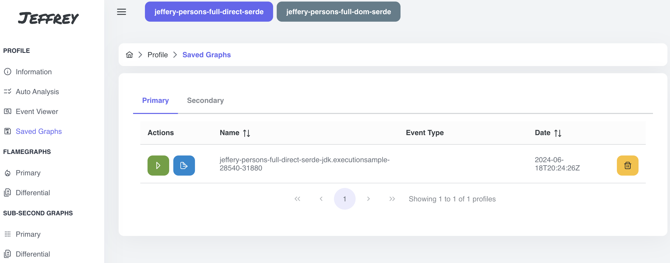
- choose jeffery-persons-full-direct-serde profile
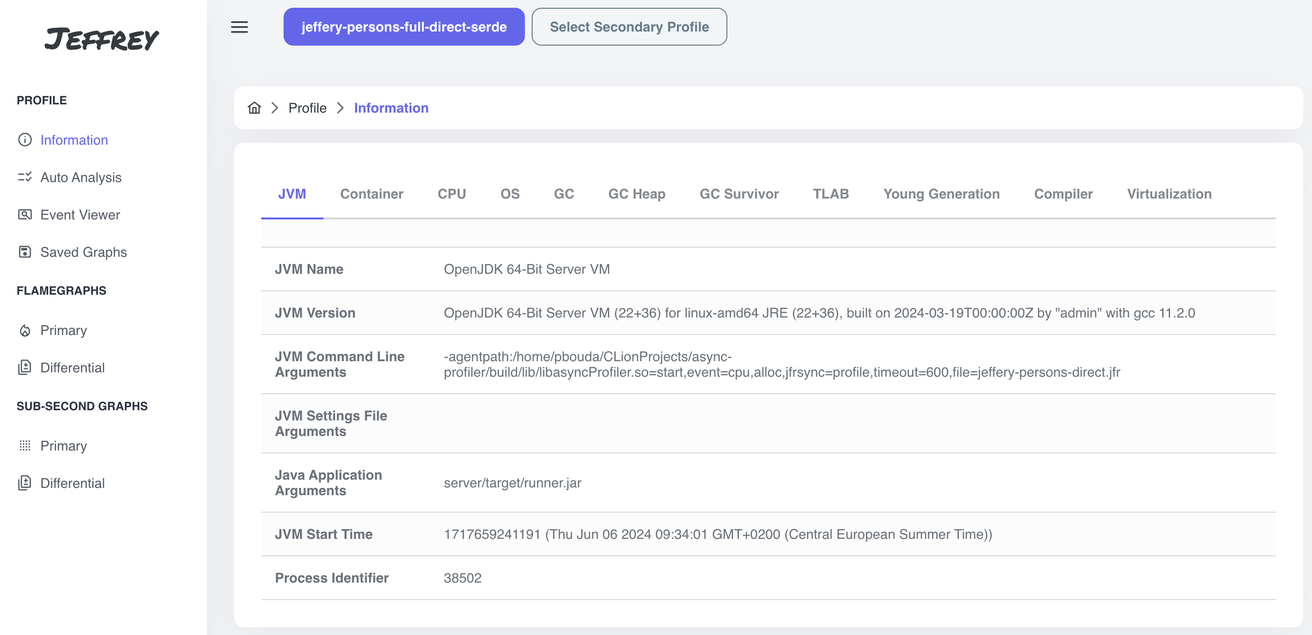
Profile’s Information
After the profile selection, the very first page contains basic information about the application and the profile.
Since we have JFR’s settings=profile, the application emitted all available configuration events.
If your profile does see any of the events above you probably have JFR’s settings=default or use AsyncProfile without jfrSync argument (more information about options for generating recordings will be available in the follow-up blog post)
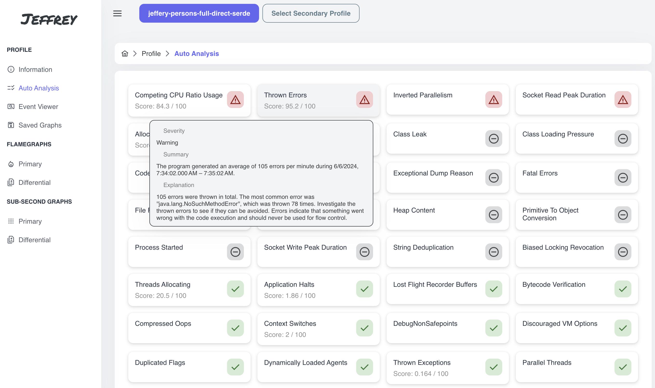
Auto Analysis
Follow with the second item on the menu: Auto Analysis. There are some predefined rules and thresholds that automatically generate recommendations with detailed explanations directly from emitted events.
Be focused on the warnings and always consider whether the warning is relevant for you and can help you to run your application efficiently.
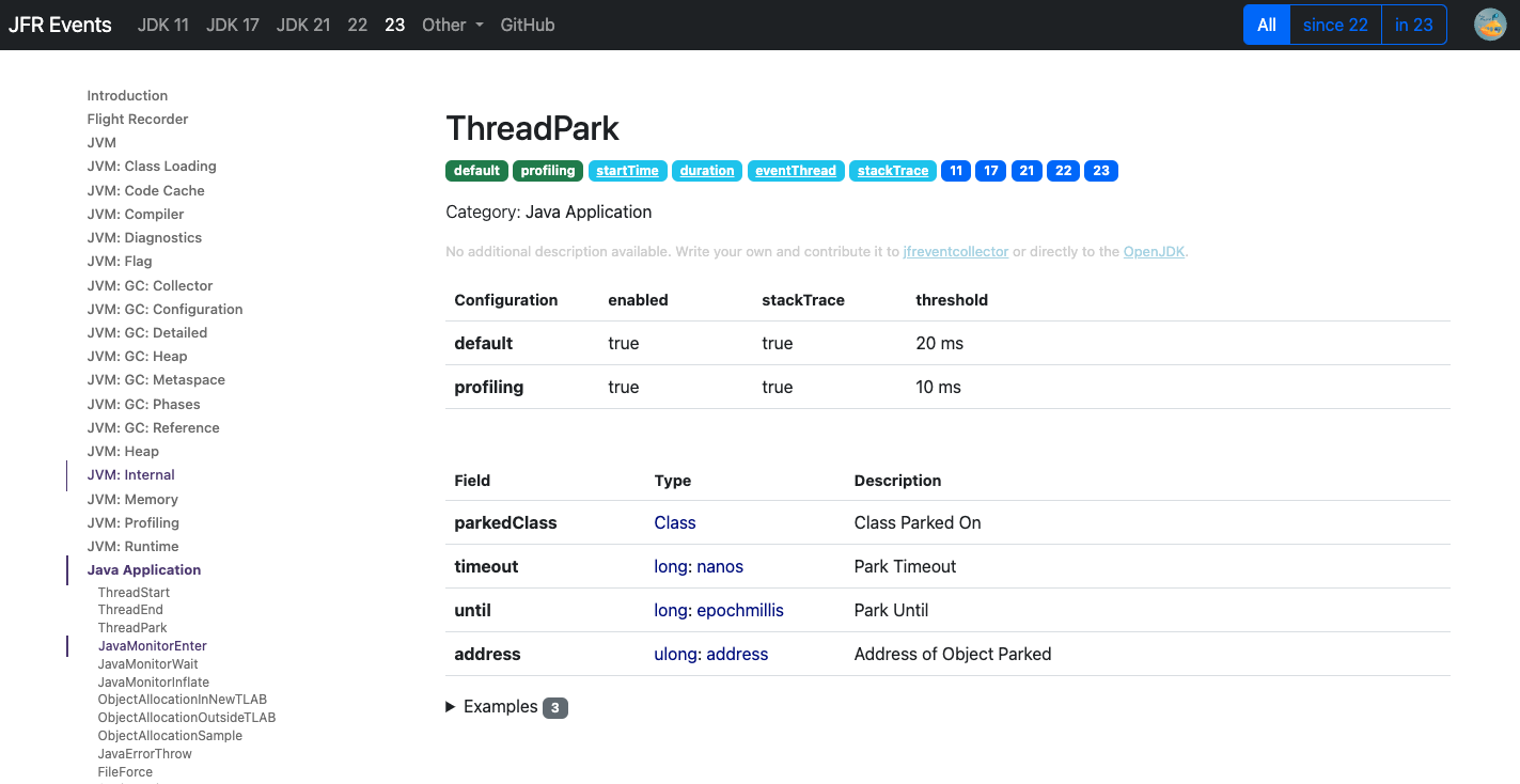
Event Viewer
In Event Viewer, we can find all events that are part of the profile. The events are summarized according to a type of the events and categorized using their metadata. There are three actions to take:
- red button - all event types containing stacktraces can be visualized using a flamegraph
- blue button - redirects to the description of the event type (e.g. https://sap.github.io/SapMachine/jfrevents/22.html#executionsample)
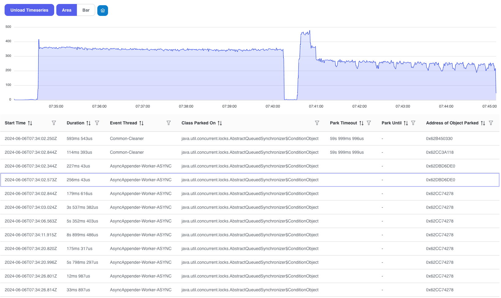
- green button - lists all events with a paginator, search and timeseries graph to pick up an interval and see the distribution of events
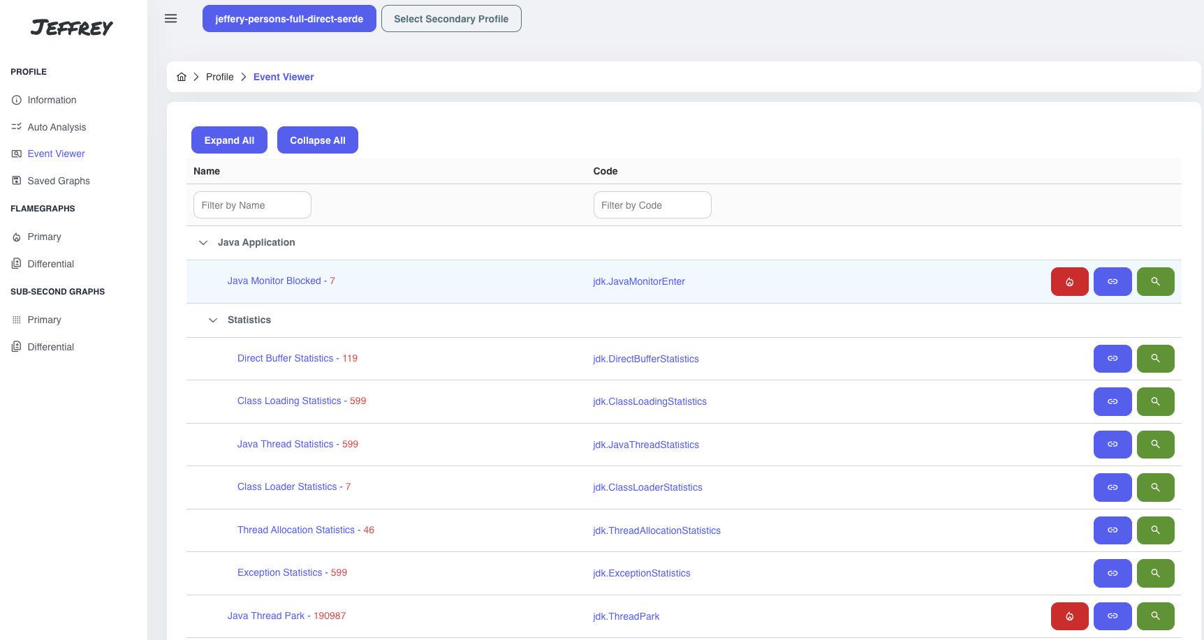
I picked up Java Thread Park event:
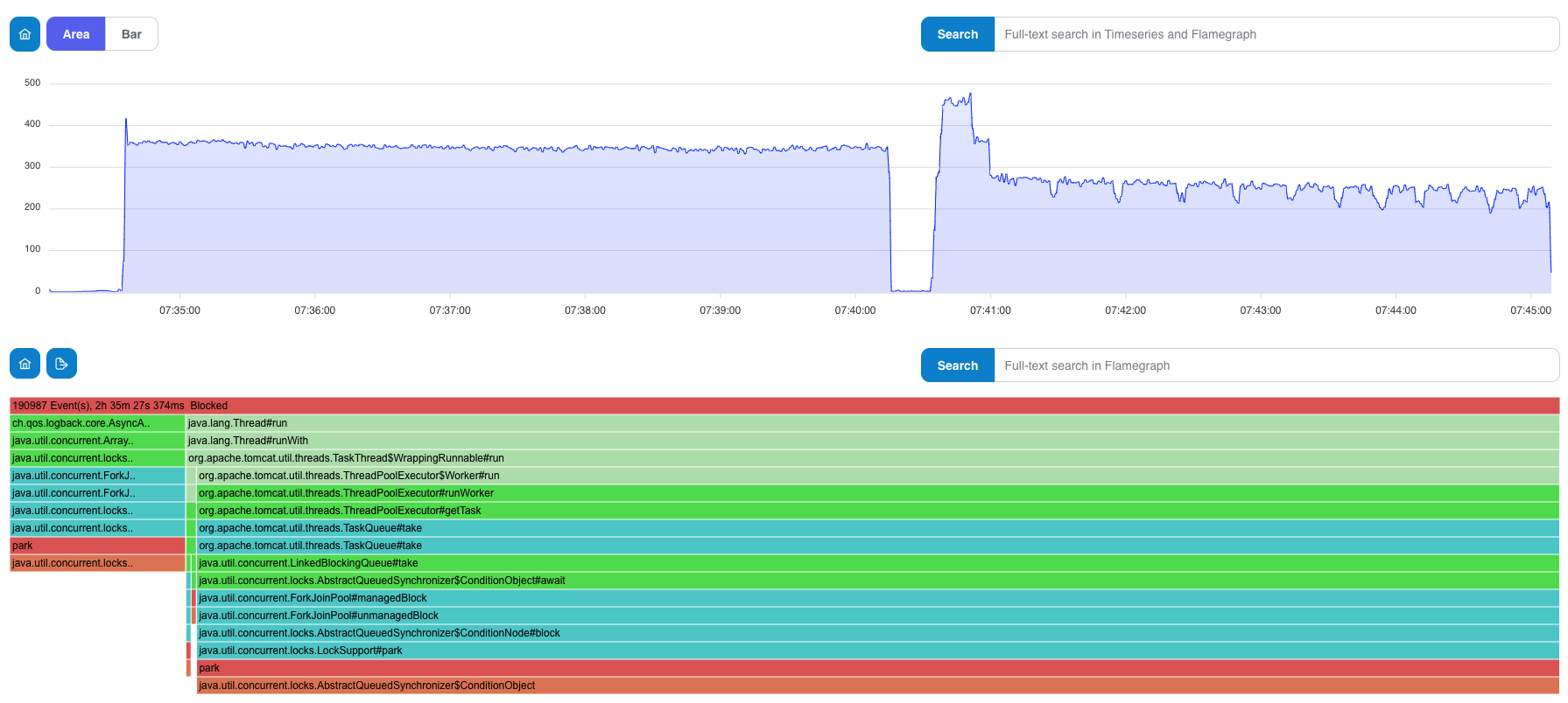
Flamegraphs
We skipped Saved Graphs sections for this moment (we’ll get back to it soon), and moved finally to flamegraphs.
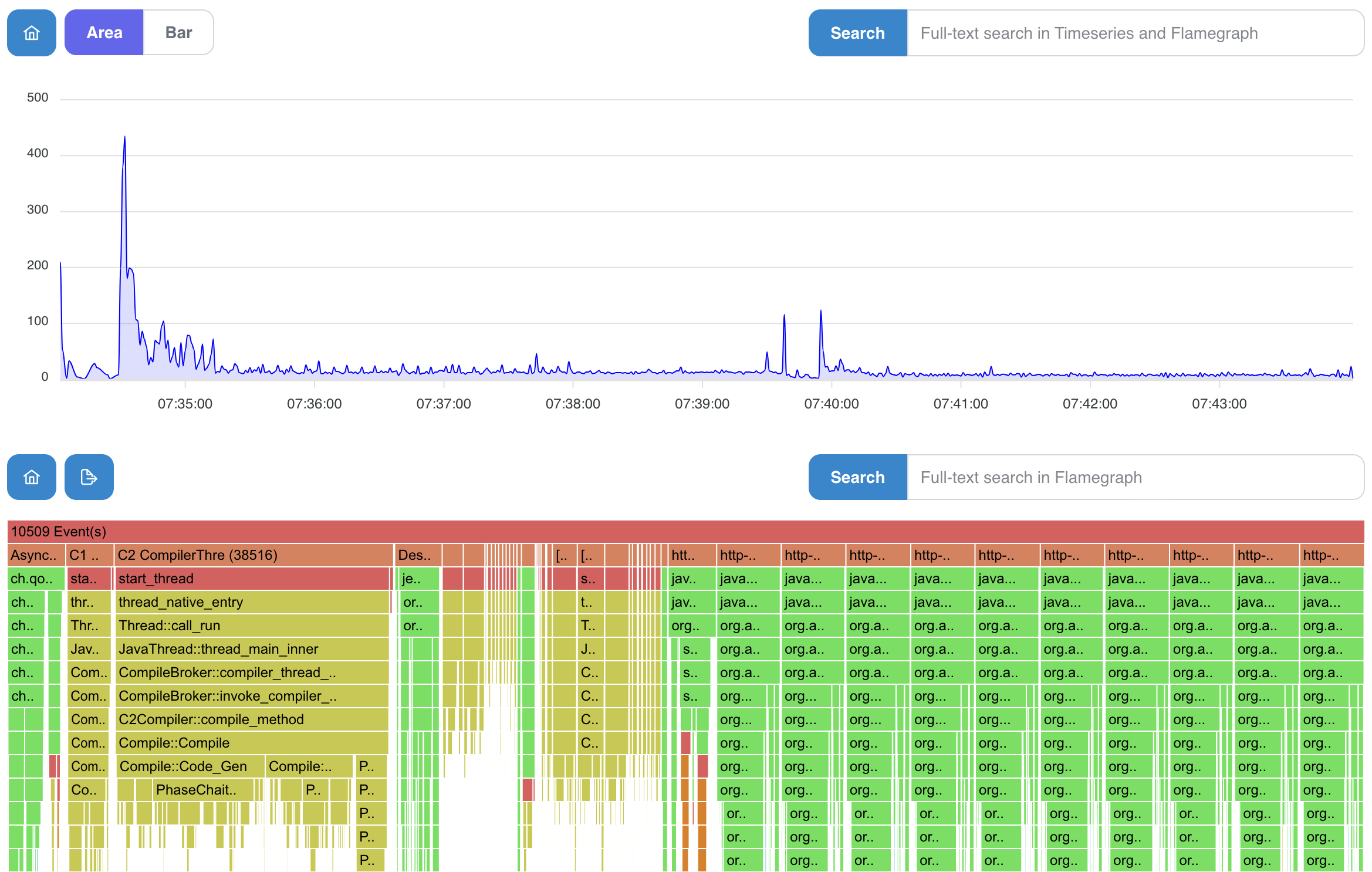
Primary Flamegraphs
In this section, you can notice predefined cards with specific flamegraph configuration. It contains basic information about the event type: total number of samples, total weight (total allocation, total blocked time, …). In the end, we can pick up specific configuration for flamegraph visualization:
- Thread-mode (grouping stacks using threads)
- Samples x Weight mode (in some cases it makes sense to use weight of the event instead of number of samples - allocation, blocking, …)
- Type of the blocking samples
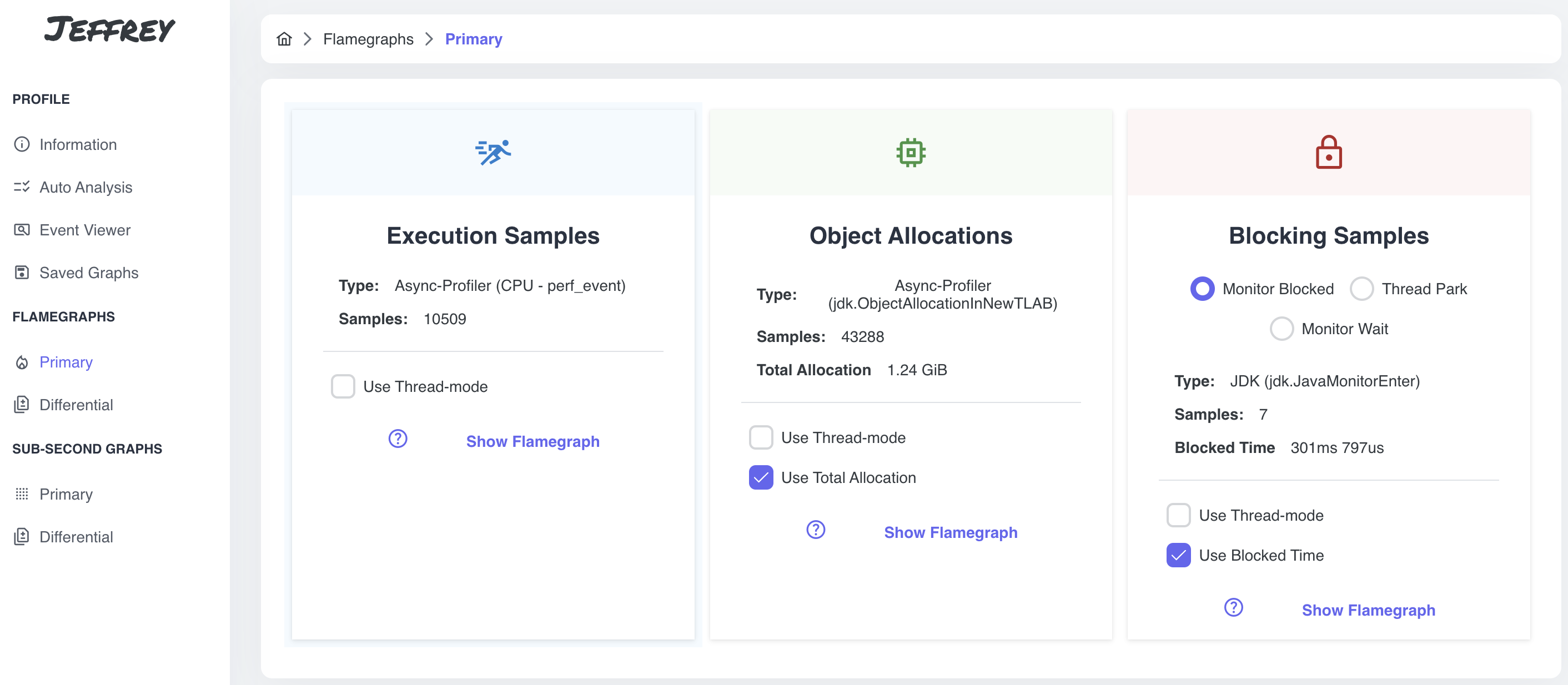
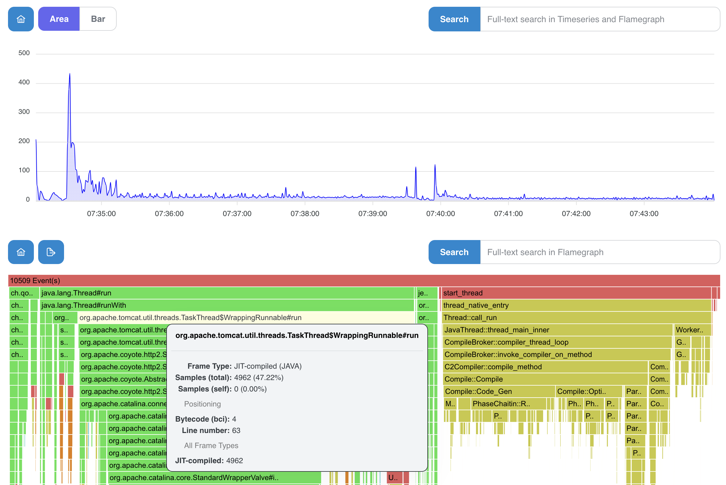
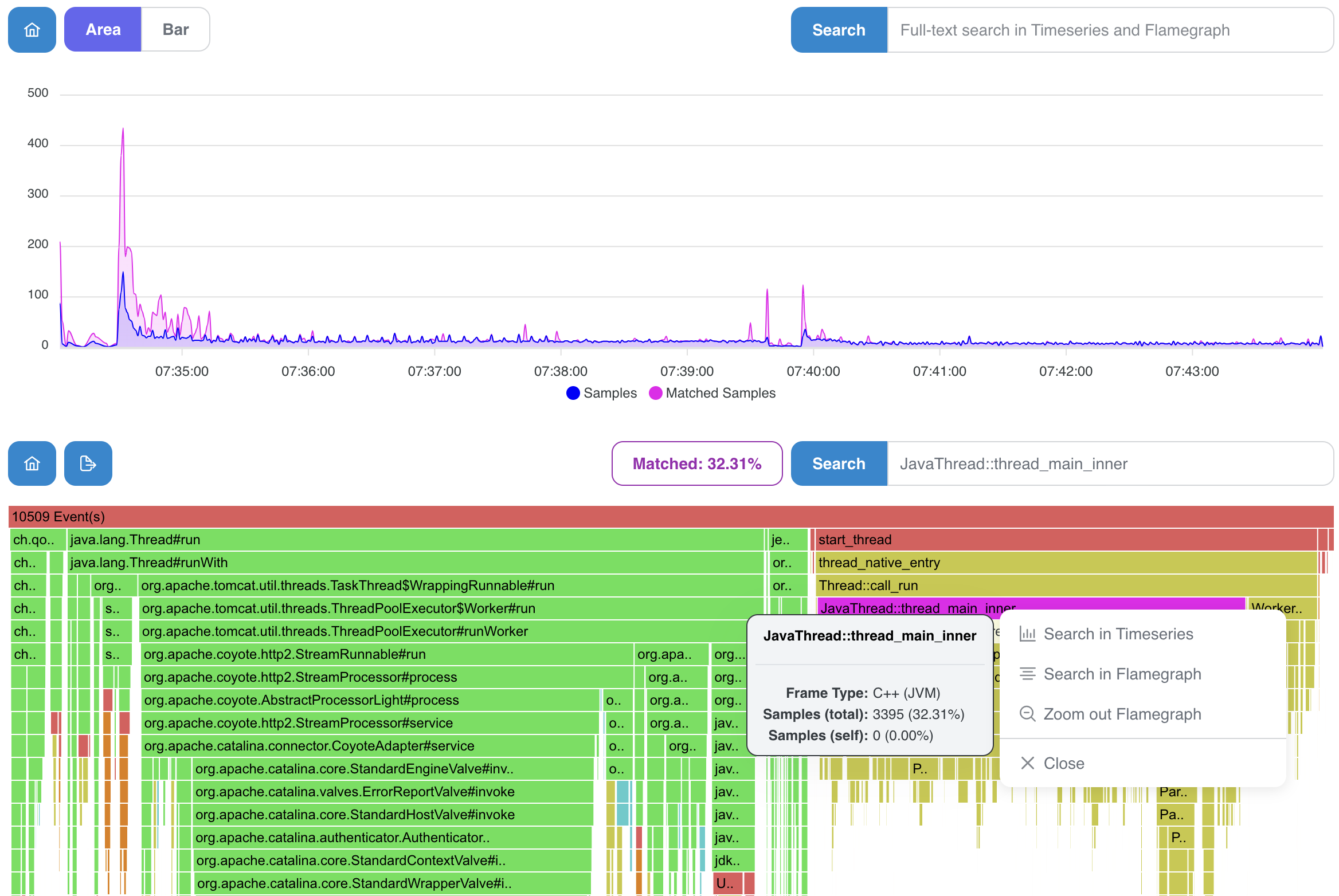
Select Execution Samples card and notice some interesting features:
- colored frames with a context window containing additional information
- 2 types of searches, for timeseries and faster only for flamegraph (easily accessible using the context menu)
- in the picture below, timeseries graph shows JIT samples against the all other samples
- it results in a nice visualization of spikes and initial JIT overhead
- we can notice a thread-mode in the picture below (especially useful for wall-clock profiling using AsyncProfiler)
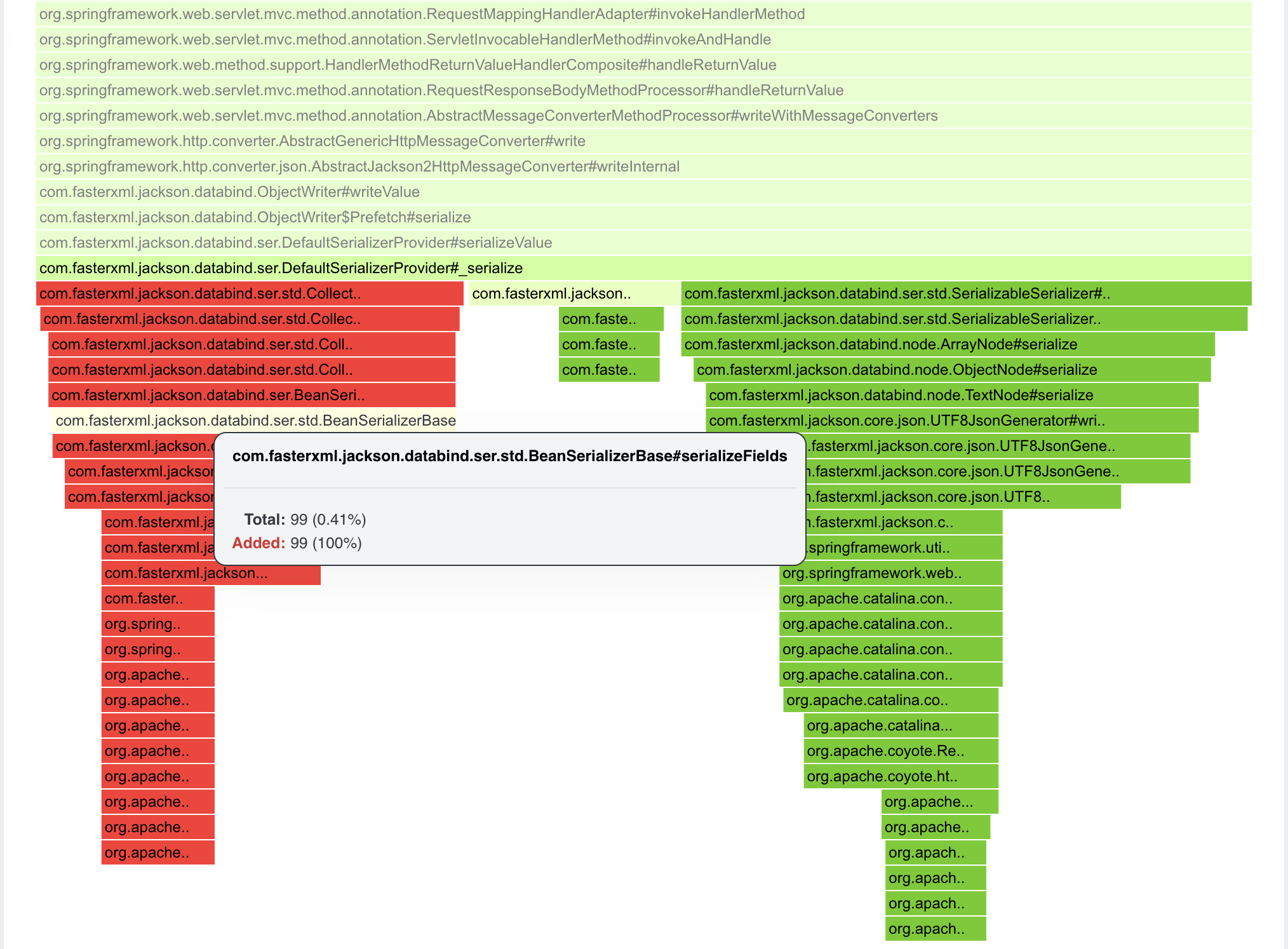
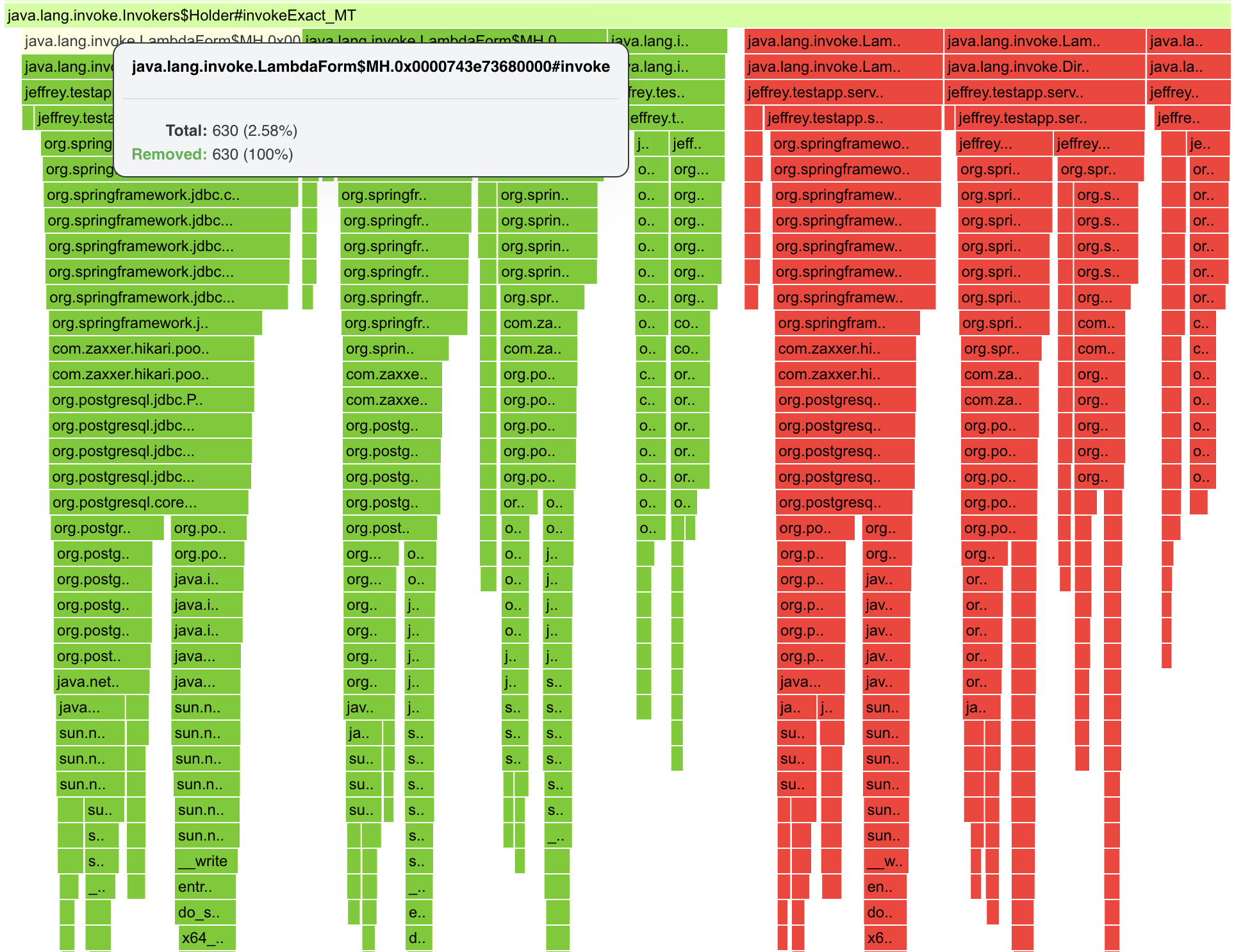
Differential Flamegraphs
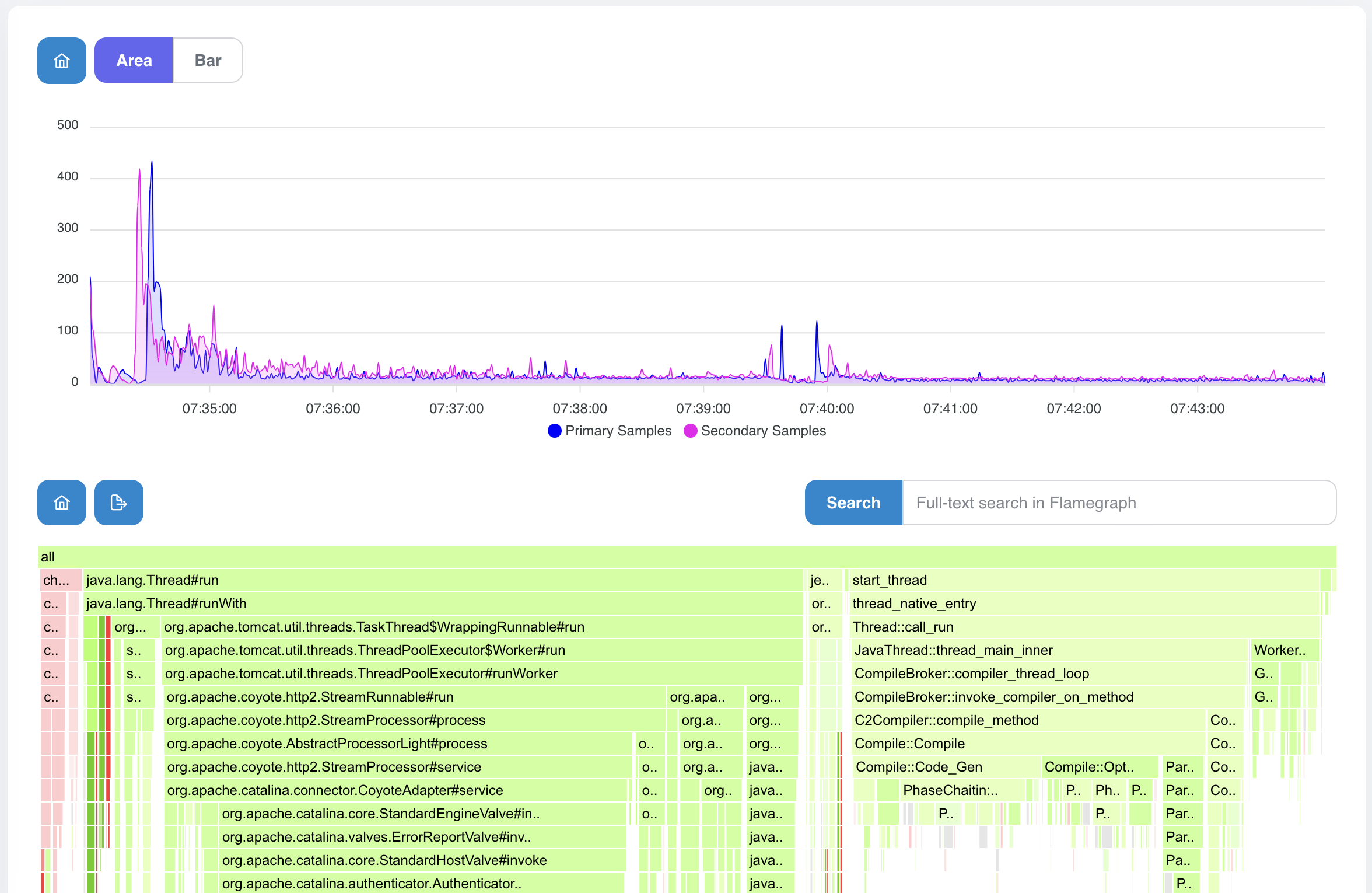
After choosing Differential Flamegraph, we will be prompted to select Secondary Profile which will be taken as a baseline for the comparison. The secondary profile is the “old one” (red in the comparison), the primary profile is the “new one” (green). The main reason for the differential graphs is to notice whether we reduced samples or weight (allocated size/blocked time/… represented by a sample).
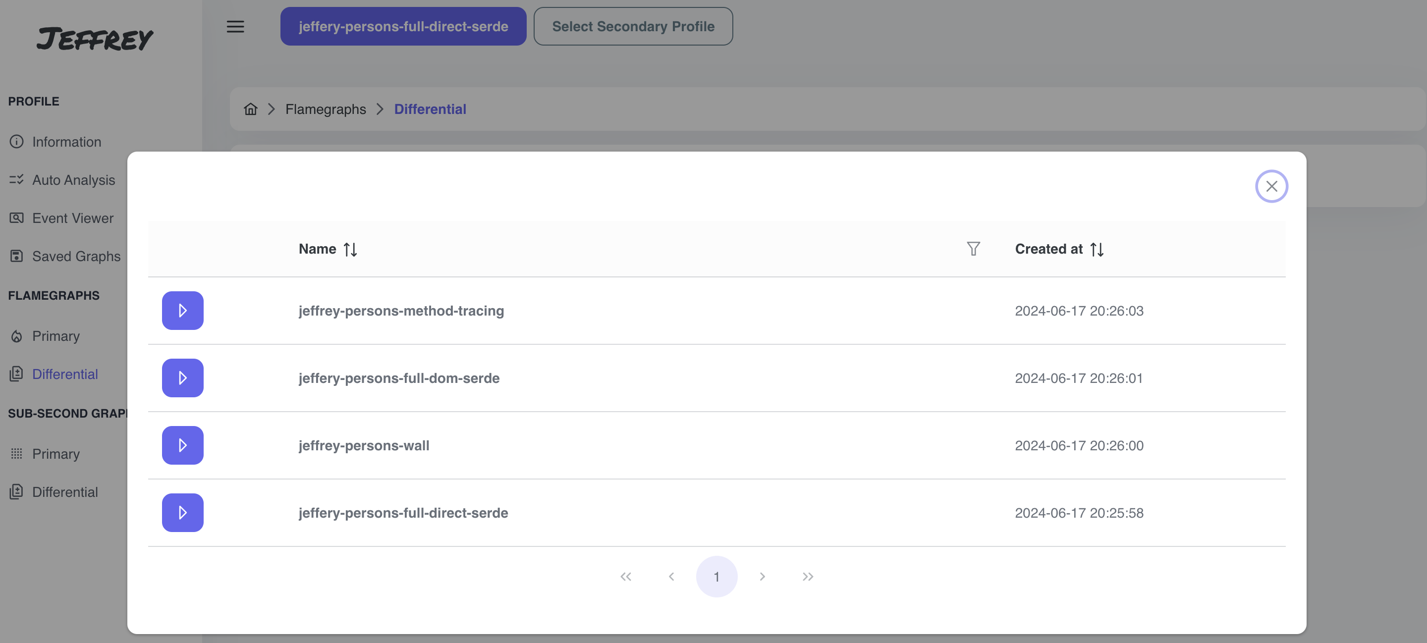
Select jeffery-persons-full-dom-serde profile. We should see some differences in marshalling and unmarshalling entities.
Differential Graphs are not so easy to interpret. Performance Engineer needs to be focused to significant differences, or needs to know what he’s looking for.
There are multiple ways to implement differential graph internally. Every implementation has strength and weaknesses. For the precise interpretation, we need to know the internal details.
The points that needs to be taken into account:
- generated code can make 100% difference between profiles
- one profile can have different number of samples because of different profile’s duration, unexpected peak during the recording, …
- do we compare exact count of samples/weight, or ration/percentage of frames (to eliminate different profile’s duration)
- different version of libraries or JDK can add an insignificant frame to stacktrace and it results in 100% difference for the rest of the stacktrace
- recording without -XX:+DebugNonSafepoints can omit some inlined frames and we’ll end up with 100% difference again
- I’ll elaborate on this topic in the specific blog post!
What we can see in the pictures below:
- the timeseries graph with both profiles, the secondary profile is moved to start at the same time as the primary one does
- green color - points to frames that were available in Secondary Profile and removed in Primary Profile
- red color - frames that appeared in Primary Profile
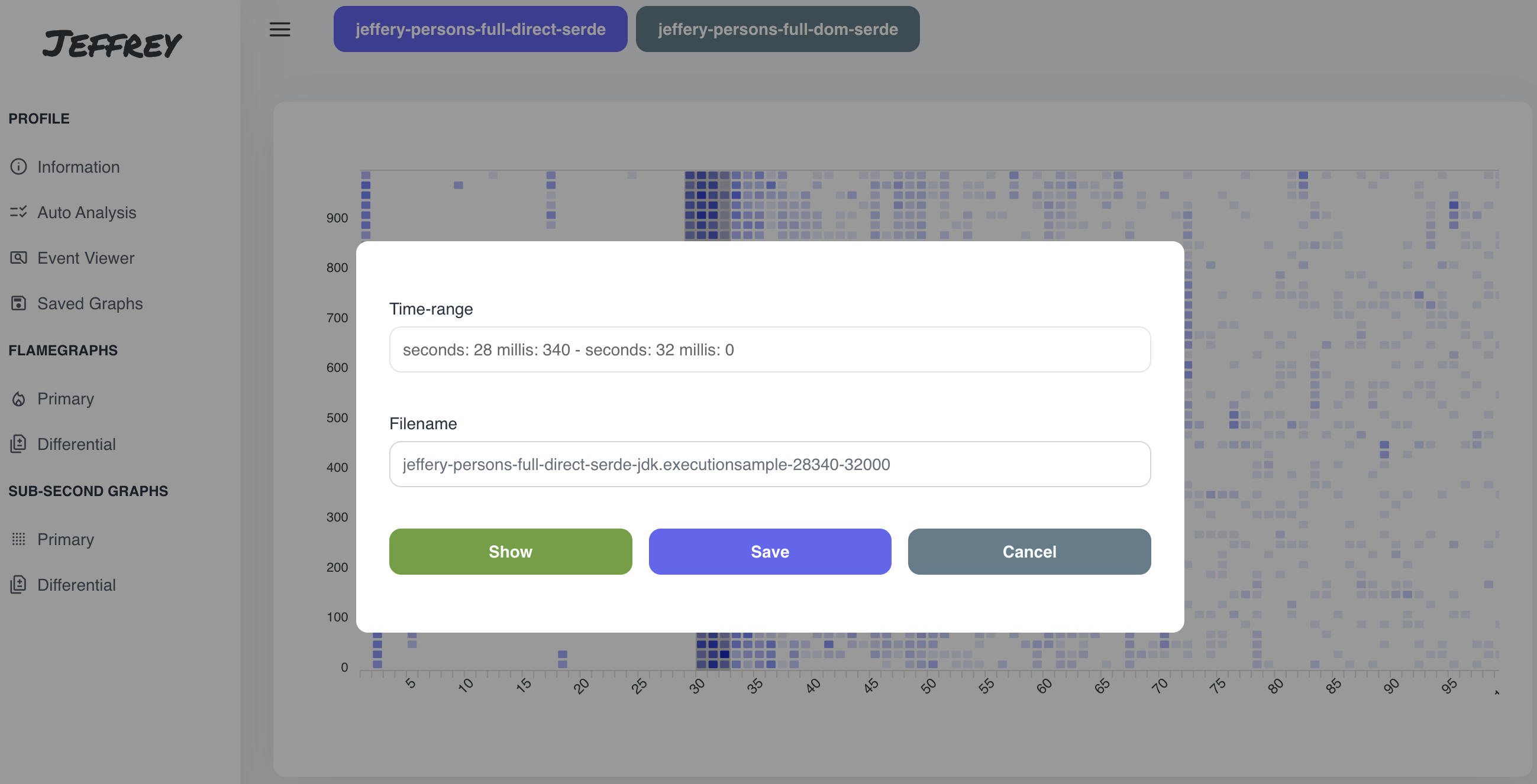
Sub-Second Graphs / Sub-Second Differential Graph
Primary and Differential Sub-Second Graph works very similarly with similar concept. The Diff approach just generates Differential flamegraphs as a result, therefore I merged the sections into a single topic.
Sub-Second Graphs are represented as a heatmap with seconds on X-axis and millis on Y-axis. This type of visualization is suitable for fine-grained tuning, e.g. to correlate spikes in the application with JIT/GC samples. One square represents 10 millis of the execution and the color is based on a number of samples in the given time period.
Currently, we are able to see just the first second of the application, so the perfect way to tune the starup of the application.
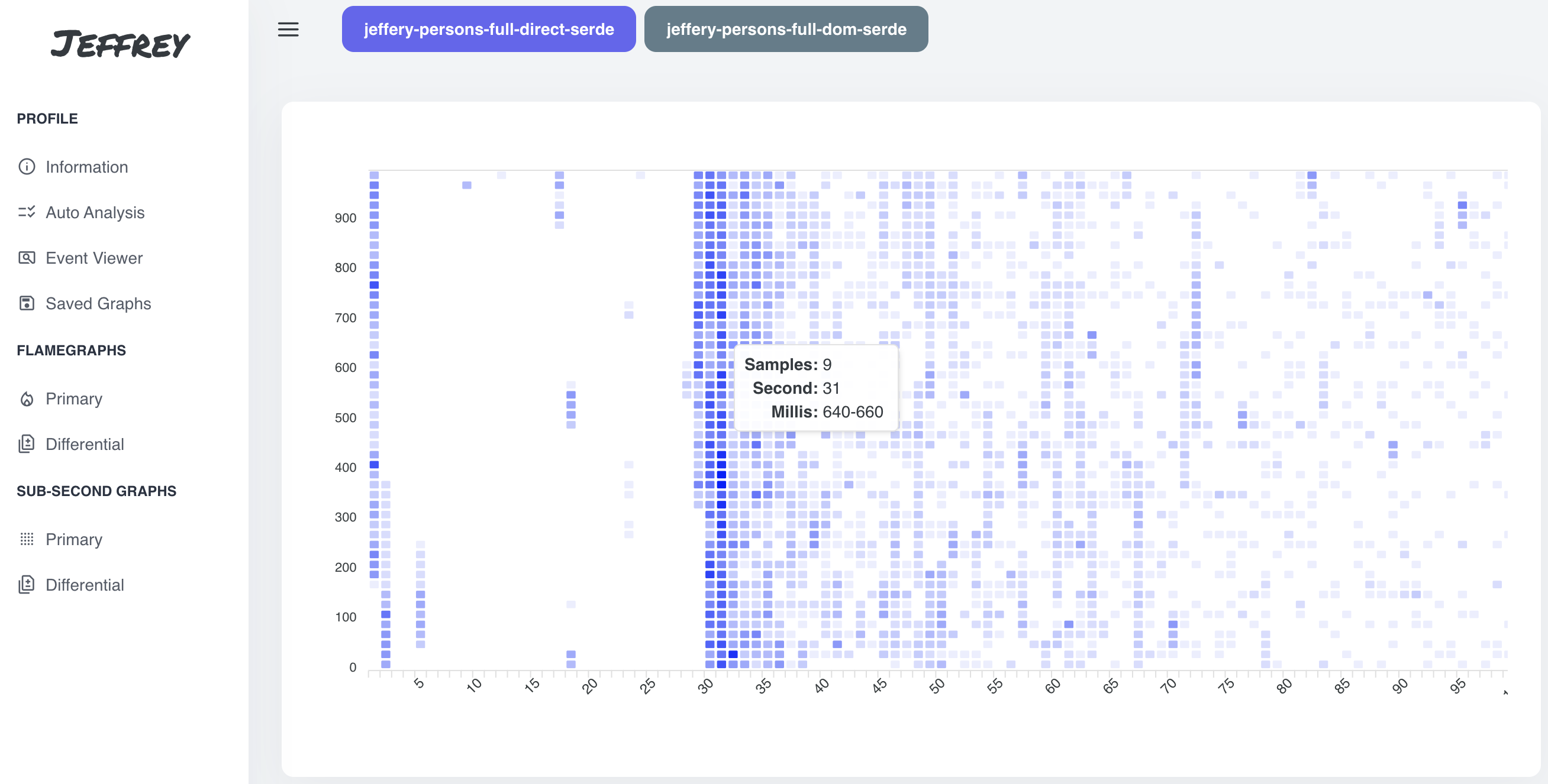
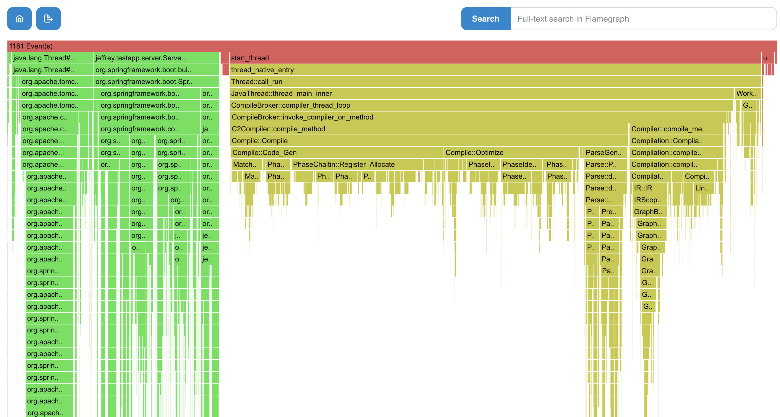
In the picture above, we can notice following:
- first 1-2 second was application startup
- the next ~28 seconds was dedicated to the container startup (blocked for downloading the container image/startup) + some spots with JIT and JFR activity
- for the next a couple of seconds the startup was resumed
- then regular processing of requests
We can select the interesting time period, and then visualize it using flamegraph or save the flamegraph for the later on.